
React components are the building blocks of our applications’ UI in 2020. As visual elements, styling them is a big part of how applications actually meet our users, and composes the way our brand and product looks and feels.
So making our components as per user friendly we started using styling in our javascript.
CSS-in-JS is not a wholly agreed upon approach for those developers who are used to the “traditional” separation of CSS from HTML tags and who have heard thousands of times that it is bad practice of mixing those two technologies together. However, nowadays it is becoming more and more popular.The main reason for this popularity is really simple: finally we can use the power of JavaScript inside our stylesheets.
We can modify styles with js(javascript) is by using inline style.Inline style is not illegal to use but also it’s not a best choice for developer’s perspective.React support inline style from very beginning which helps to style our component as per requirement.So moving to the best choice of making component more user friendly and interactive we can various library, so in my opinion we can use the best and famous styled components.
Why styled-components?
1. Developer Experience focus
For me, this is the big differentiator between styled-components and competitor libraries in the same space. Instead of a plethora of packages to download and consume, all of the core library and most popular pieces of functionality are available right in the main import. This makes the library easier to refactor, teach, and ultimately understand.
Further, we spend a lot of thought and effort on implementing helpful dev-time warnings and useful production errors to help you avoid falling into performance anti-patterns. Do we get it right every time? No, but no other competitor library is putting in the same amount of consideration.
2. Raised in Performance
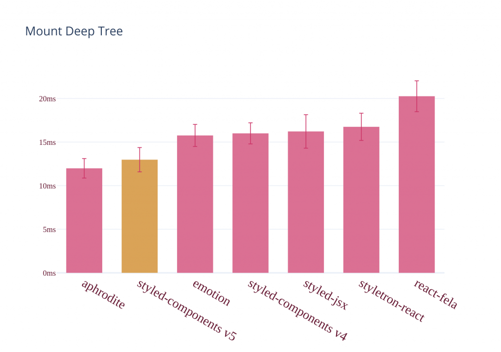
There is high raise in performance by using this library as it is fast and high compatibility with different libraries present in application.
Steps using styled-components?
1. Step-1
Installation:-
npm install --save styled-componentsStep-2
Getting started:-
Customising html elements:-
// Create a Title component that'll render an <h1> tag with some styles
const Title = styled.h1`
 font-size: 1.5em;
 text-align: center;
 color: palevioletred;
`;
// Create a Wrapper component that'll render a <section> tag with some styles
const Wrapper = styled.section`
 padding: 4em;
 background: papayawhip;
`;
// Use Title and Wrapper like any other React component – except they're styled!
render(
 <Wrapper>
   <Title>Hello World!</Title>
 </Wrapper>
);
Customising button from any library:-
//stye.js
import styled from 'styled-components';
import Button from 'antd/lib/button';//you can import button from any library or it can be your button element of html

export const CustomButton = styled(Button)`
//Your style goes here for button
Adding props and customising props for Button:-
import styled from 'styled-components';
const Button = styled.button`
 /* Adapt the colors based on primary prop */
 background: ${props => props.primary ? "palevioletred" : "white"};
 color: ${props => props.primary ? "white" : "palevioletred"};
 font-size: 1em;
 margin: 1em;
 padding: 0.25em 1em;
 border: 2px solid palevioletred;
 border-radius: 3px;
`;
render(
 <div>
   <Button>Normal</Button>
   <Button primary>Primary</Button>
 </div>
);
Adding more props on the basis of condition using switch case:-
import styled from 'styled-components';
import Button from 'antd/lib/button';

const ButtonColor = (type)=>{
 switch(type){
   case 'primary':
     return 'blue';
   case 'danger':
     return 'red';
   default:
     return '#000'
 }
}
const CustomButton = styled(Button)`
   color:${props => ButtonColor(props.type)};
`;
<CustomButton type="danger">Custom button</CustomButton>
Extending Styles:-
Extending style means you can use previous written style for your next component by adding more conditions or props to it.
import styled from 'styled-components';
import Button from 'antd/lib/button';

const ButtonColor = (type)=>{
 switch(type){
   case 'primary':
     return 'blue';
   case 'danger':
     return 'red';
   default:
     return '#000'
 }
}
const BorderStyle = (type)=>{
   switch(type){
     case 'dashed':
       return 'dashed';
     case 'dotted':
       return 'dotted';
     default:
       return 'solid'
   }
 }
const CustomButton = styled(Button)`
   color:${props => ButtonColor(props.type)};
`;

const NextButton = styled(CustomButton)`
   border-style: ${props => BorderStyle(props.type)};
`;
 render(
   <CustomButton type="danger">Custom button</CustomButton>
   <NextButton border-style="dashed" type="primary">Dashed button</NextButton>
 );
Styling any component:-
The styled method works perfectly on all of your own or any third-party component, as long as they attach the passed className prop to a DOM element.
// This could be react-router-dom's Link for example
const Link = ({ className, children }) => (
   <a className={className}>
     {children}
   </a>
 );
 const StyledLink = styled(Link)`
   color: red;
   font-weight: bold;
 `;
 render(
   <div>
     <Link>Unstyled Link :(</Link>
     <br />
     <StyledLink>Styled Link :)</StyledLink>
   </div>
 );
What else can I do?
styled-components has more useful features including:
- Nested rules – if you are familiar with SASS or LESS preprocessor you know how nesting rules can be useful. With styled-components it is possible too
- Vendor prefixing – forget about adding extra prefixes for specific browsers. This step is done for you automatically
- Scoped selectors – you don’t have to think about naming conventions or methodologies like BEM to avoid selector collisions on your pages
- Dead code elimination – styled-components has an optional configuration to remove code which does not affect the program results
- Stylelint support – good real-time linting is priceless when you have to debug your styles
- React Native support – this is a huge feature! React Native supports only camelCase syntax by default but you can safely use styled-components to style native controls
- Theming – styled-components uses a similar approach to new React context api for theming. Switching between different templates can be really easy!
- Server side rendering support – by using ServerStyleSheet object and StyleSheetManager you can utilize all styles from the client side and returns them from the server side
- Code minification – your application will be smaller and what is important – this feature is enabled by default!
- Plugin for Jest test framework – an absolutely necessary thing for snapshot testing
- Plugins for popular editors – coding styles without syntax highlighting can be a pain in the neck but fortunately there are appropriate plugins for editors like VS Code, Sublime Text or Vim
As you can see, there are a lot of features which you can use while working with styled-components.
Reference taken from: