
Building a Shared Material UI Snackbar for In-App Notifications
What is Context ?
Context provides a way to pass data through the component tree without having to pass props down manually at every level.
Why Context ?
In a typical React application, data is passed top-down (parent to child) via props, but this can be cumbersome for certain types of props (e.g. locale preference, UI theme) that are required by many components within an application. Context provides a way to share values like these between components without having to explicitly pass a prop through every level of the tree.
Preface
Most apps need a way to unobtrusively display notifications to users as they happen. Suppose you’re running a 20% off sale and you’d like to let your users know as soon as they sign in, or maybe after they submit feedback you want to display a thank you message.
Many apps need to trigger messages from dozens of different components. The React Context API makes it dead simple to provide all components access to a shared snackbar so they can trigger these messages without needing to implement separate components for each message. Here’s how.
Setup/Dependencies
This post assumes you already have a React app set up with @material-ui/core 1.0.0+ and @material-ui/icons 1.0.0+ installed as dependencies.
Creating the Context
First, we need to create our Context API provider and consumer components. The provider provides the state of our snackbar, as well as some functions for manipulating that state, to all consumers. This allows all child components to access and manipulate the provider’s state no matter how deep they are within the component hierarchy. No prop drilling required!
import React, { Component } from 'react';
const SharedSnackbarContext = React.createContext();
export class SharedSnackbarProvider extends Component {
  constructor(props) {
    super(props);
    this.state = {
      isOpen: false,
      message: '',
    };
  }

  openSnackbar = message => {
    this.setState({
      message,
      isOpen: true,
    });
  };

  closeSnackbar = () => {
    this.setState({
      message: '',
      isOpen: false,
    });
  };

  render() {
    const { children } = this.props;

    return (
      <SharedSnackbarContext.Provider
        value={{
          openSnackbar: this.openSnackbar,
          closeSnackbar: this.closeSnackbar,
          snackbarIsOpen: this.state.isOpen,
          message: this.state.message,
        }}


        {children}
      </SharedSnackbarContext.Provider>
    ); } }
export const SharedSnackbarConsumer = SharedSnackbarContext.Consumer;
The first step is creating a context by calling React.createContext(). The object returned contains two properties, Provider and Consumer. We use these to build out the components that will manage and interact with the snackbar’s state.
From here on out, when I use the terms “provider” and “consumer”, I’m referring to the SharedSnackbarProvider and SharedSnackbarConsumer components from this section.
As you can see, our provider is a pretty standard component. In its render function, we render a SharedSnackbarContext.Provider component with a value prop. The object passed to the value prop is what consumers will be able to access so they can interact with our snackbar. For lack of a better term, this is the API for our shared snackbar component.
Creating the Shared Snackbar Component
Now we need to build the presentation component responsible for rendering the snackbar UI based on the state of the provider. This component will use the consumer to access the properties it needs for rendering.
import { IconButton, Snackbar } from '@material-ui/core';
import { Close } from '@material-ui/icons';
import React from 'react';
import { SharedSnackbarConsumer } from './SharedSnackbar.context';

const SharedSnackbar = () => (
  <SharedSnackbarConsumer>
    {({ snackbarIsOpen, message, closeSnackbar }) => (
      <Snackbar
        anchorOrigin={{
          vertical: 'bottom',
          horizontal: 'left',
        }}
        open={snackbarIsOpen}
        autoHideDuration={6000}
        onClose={closeSnackbar}
        message={message}
        action={[
          <IconButton key="close" color="inherit" onClick={closeSnackbar}>
            <Close />
          </IconButton>,
        ]}   /   )}
  </SharedSnackbarConsumer>
);

export default SharedSnackbar;
Here we’ve built a component that renders the snackbar UI in a function within the SharedSnackbarConsumer component. The argument to the function is the value prop object we exposed from our provider. As a result, when the state of the provider is updated, it will trigger the snackbar component to rerender.Now we can render this component in our provider’s render function.
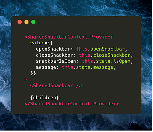
<SharedSnackbarContext.Provider
    value={{
      openSnackbar: this.openSnackbar,
      closeSnackbar: this.closeSnackbar,
      snackbarIsOpen: this.state.isOpen,
      message: this.state.message,
    }}
  >
    <SharedSnackbar />      // This is the line that changed!

    {children}
  </SharedSnackbarContext.Provider>
Rendering the Provider
At this point, we’re almost finished with the infrastructure. There’s just one last thing to do, which is to render the provider within our app. I’m going to place the provider at the root of the entire app so that all children have access to the snackbar.
import React, { Component } from 'react';
import ButtonA from './ButtonA.component';
import ButtonB from './ButtonB.component';
import { SharedSnackbarProvider } from './SharedSnackbar.context';

const styles = {
  app: {
    display: 'flex',
    justifyContent: 'center',
    alignItems: 'center',
    height: '100vh',
  },
};

class App extends Component {
  render() {
    return (
      <div style={styles.app}>
        <SharedSnackbarProvider>
          <ButtonA />
          <ButtonB />
        </SharedSnackbarProvider>
      </div>
    );
  } }
export default App;
Opening the Snackbar from Child Components
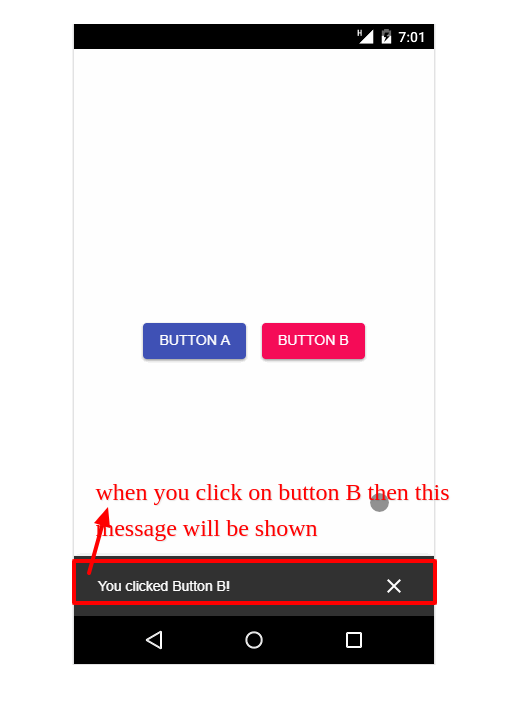
Now, ButtonA and ButtonB can render their UI and trigger in-app messages without needing to directly receive props from the root of the app!
import { Button } from '@material-ui/core';
import React from 'react';
import { SharedSnackbarConsumer } from './SharedSnackbar.context';

const styles = {
  button: {
    margin: 8,
  },
};

const ButtonA = () => (
  <SharedSnackbarConsumer>
    {({ openSnackbar }) => (
      <Button
        style={styles.button}
        variant="raised"
        color="primary"
        onClick={() => openSnackbar('You clicked Button A!')}
      >
        Button A
      </Button>
    )}
  </SharedSnackbarConsumer>
);
export default ButtonA;
import { Button } from '@material-ui/core';
import React from 'react';
import { SharedSnackbarConsumer } from './SharedSnackbar.context';
const styles = {
button: {
margin: 8,
},
};
const ButtonB = () => (
<SharedSnackbarConsumer>
{({ openSnackbar }) => (
<Button
style={styles.button}
variant="raised"
color="secondary"
onClick={() => openSnackbar('You clicked Button B!')}
>
Button B
</Button>
)}
</SharedSnackbarConsumer>
);
export default ButtonB;Summary
In summary, here’s what happening.
- First, we created a context provider component which manages the global state for our snackbar.
- We then created a component that renders the snackbar’s UI based on the state of the provider. This component subscribes to the provider state in its render function via a context consumer.
Finally, we rendered two buttons that update the state of the context provider with the openSnackbar function, which was passed to them via a context consumer. This results in the changes propagating down to the snackbar component, triggering a re-render.
Material UI provides a number of other snackbar features I did not implement with this example, such as action buttons and color
customization. For the sake of simplicity I didn’t add the ability to customize those features. Adding that logic yourself would be a great next step if you’re really looking to learn the Context API!