CSS works with HTML and provides a basic style and look to the website. CSS3 is the latest version of CSS. CSS3 provides JavaScript and mobile development features with additional features such as transitions, gradients, and more.
Here are many CSS3 features, along with a quick code implementation that you could stick in any HTML page:
Box Shadows
You’ll usually find this effect used subtly to surround item containers on a webpage. the shadow had to be a separate image slice. With CSS3, you can now easily create a shadow around an element with some code. Basically box shadows give an attractive view for the user and a beautiful design.
.box{
box-shadow: 10px 10px 5px 0px rgba(0,0,0,0.75);
}
Rounded Corners
This is already very popular on the web. Honestly, rounded corners just look more user-friendly than square boxes. The best part now is, you can apply this effect to HTML elements with CSS3. That’s good because you’ll find rounded corners almost everywhere. For example
.box{ Border-radius: 50px; }
Text Shadows
You can add a shadow to HTML text that can then be highlighted, copied, and pasted just like normal text. The old way involved typing the words you wanted in Photoshop, applying a drop shadow.
P{text-shadow: 2px 2px #fff }
Opacity
This property makes can make elements more see-through. You could go about setting the opacity of an image in an image editor, and then save it as a .png or .gif file with transparency enabled. We can hide objects using this property. Opacity range 0 to 10.
.box{opacity:5;}
Background Gradients
CSS gradients let you display smooth transitions between two or more specified colours. You can choose between three types of gradients: linear (created with the linear-gradient() function), radial (created with radial-gradient() ), and conic (created with the conic-gradient() function).
.box {
background-image: linear-gradient(red, yellow);
}
.box {
background-image: radial-gradient(red, yellow, green);
}.
Rem values
Rem values are relative to the root HTML element, not to the parent element. That is, If font-size of the root element is 16px then 1 rem = 16px for all elements.
Flexbox
Flexbox mostly helps align content & move blocks. Flexbox works better in one dimension only (either rows OR columns). It will be more time saving and helpful.
Grid
Grid Layout Module offers a grid-based layout system, with rows and columns, making it easier to design web pages without having to use floats and positioning.
Background-image
The CSS3 background-image property is used to set a background image for an HTML element.
Background-size
The CSS background-size property controls the size of an HTML element’s background image.
CSS3 Borders
The CSS3 provides two new properties for styling the borders of an element more elegantly the border-image property for adding the images to borders.
Colors in CSS3
In addition to that CSS3 adds some new functional notations for setting color values for the elements which are rgba(), hsl() and hsla().
CSS3 Backgrounds
The CSS3 provides several new properties to manipulate the background of an element like background clipping, multiple backgrounds, and the option to adjust the background size.
Handling Text Overflow in CSS3
CSS3 introduced several new property properties for modifying the text contents, however, some of these properties exist for a long time. These properties give you precise control over the rendering of text on the web browser.
Hiding Overflow Text
Text can overflow, when it is prevented from wrapping, for example, if the value of the white-space property is set to nowrap for the containing element or a single word is too long to fit like a long email address.
Values Accepted by the word-break property are clip and ellipsis and string.
Drop Shadows
The CSS3 gives you the ability to add drop shadow effects to the elements like you do in Photoshop without using any images. Before CSS3, sliced images are used for creating the shadows around the elements that were quite annoying.
2D Transforms
? 2D Transformation of Elements
With the CSS3 2D transform feature, you can perform basic transform manipulations such as move, rotate, scale,, and skew on elements in a two-dimensional space.
A transformed element doesn’t affect the surrounding elements but can overlap them, just like the positioned elements.
? CSS Transform and Transform Functions
The CSS3 transform property uses the transform functions to manipulate the coordinate system used by an element to apply the transformation effect.
The following section describes these transform functions:
The translate() Function
Moves the element from its current position to a new position along the X and Y axes. This can be written as translate(tx, ty). If ty isn’t specified, its value is assumed to be zero.
? 3D Transformation of Elements
With CSS3 3D transform feature you can perform basic transform manipulations such as move, rotate, scale and skew on elements in a three-dimensional space.
? Using CSS Transform and Transform Functions
The CSS3 transform property uses the transform functions to manipulate the coordinate system used by an element to apply the transformation effect.
The following section describes the 3D transform functions:
? The translate3d() Function
Moves the element from its current position to a new position along the X, Y and Z-axis. This can be written as translate(tx, ty, tz).
Transitions
Normally when the value of a CSS property changes, the rendered result is instantly updated. A common example is changing the background color of a button on a mouse hover. Then delay the changes using this property
CSS3 introduces a new transition feature that allows you to animate a property from the old value to the new value smoothly over time.
CSS3 Animations
The CSS3 animations take it a step further with keyframe-based animations that allow you to specify the changes in CSS properties over time as a set of keyframes, like flash animations. Creating CSS animations is a two-step process, as shown in the example below:
The first step of building a CSS animation is to define individual keyframes and name an animation with a keyframes declaration. The second step is referencing the keyframes by name using the animation-name property as well as adding animation-duration.
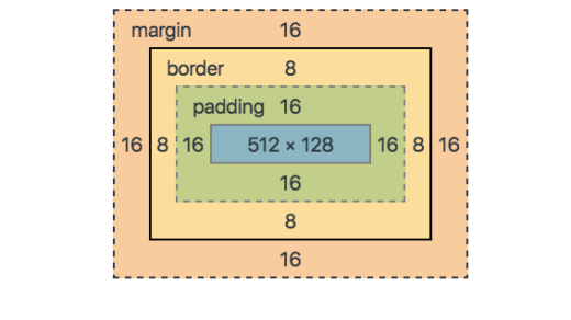
CSS3 Box Sizing
Box Sizing
By default, the actual width or height of an element’s box visible/rendered on a web page depends on its width or height, padding, and border property. For example, if you apply some padding and border on an <div> element with 100% width the horizontal scrollbar will appear, as you can see in the example below.
Filters
CSS3 that you can use to perform visual effect operations like a blur, balancing contrast or brightness, colour-colour san the ion, etc. The filter effects can be applied to the element using the CSS3 filter property,
Filter: blur() | brightness | contrast() | drop-shadow() | grayscale() | hue-rotate | invert() | opacity().
Media Queries
Media queries allow you to customize the presentation of your web pages for a specific range of devices like mobile phones, tablets, desktops, etc. without any change in markups. A media query consists of a media type and zero or more expressions that match the type and conditions of a particular media feature such as device width or screen resolution.