The CSS Box Model is used to create a definition for the way the HTML elements are organized on the screen. This approach accounts for options such as margins, padding, borders, and all the properties that manipulate them.
Each element can be thought of as having its own box. As all the elements on a page have to work together with each other, it is quite important to know just how each of those boxes works. This brief tutorial will help explain the box model for beginners.
Just What Is the CSS Box Model
The CSS Box Model is a term used for the container that wraps the following element properties within it.
- Margin
- Border
- Padding
- Content
- Height and Width
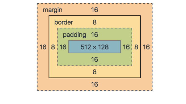
Understanding the term “Box Model” makes more sense once it is visually displayed. See the example image below for a more straight breakdown of where these bullet points relate to your HTML content

The content sits inside the box model. In this case, you have an example “p,” (or paragraph) element on display with the simple text “Udacity CSS Box Model Example” shown. In the next few sections, each of these areas will be explained.
Margin
On the CSS Box Model, the margin is the section in the exterior. This edge extends around the box model taking the empty space between the margin and border properties. You can consider this a buffer area that separates the interior of the CSS box model from other HTML elements on a page.
Border
We have the Border property of the CSS Box Model. Keeping in the theme of separation, this area exists as a boundary between the margin and padding properties of the box. This area can be manipulated using the CSS Border property for styling and sizing needs.
Padding
The padding section of the CSS Box Model sits in the space between the HTML content and the border. As with much of the other items in the box mode, the padding can be altered through its related properties. For example, the padding can be changed through the directions of the top, right, bottom, and left sections.
Example.
div {
  border-style: solid;
 border-color: blue;
  }
This div does not have padding defined, as such, you have the output shown in the image below.

Now, the same code is used but a padding value of 40 pixels has been added.
div {
padding: 40px;
border-style: solid;
border-color: blue;
  }
This will now alter the padding to give you the following image.

It’s easy to see that the added padding between the div content and the border has changed considerably.
Content
The Content is the center of the “tootsie pop,” so to say. This is the main HTML content you are working to display on the site. This can range from an image, a paragraph, or even a web button. While this is quite direct in definition, it should be noted that “content” can be empty space as well. Using an empty div for example can be a neat way to add extra creative components to a site design.
Height and Width
The properties for height and width on the box model are set through the calculations of the applied contents. However, these can also be specified directly as needed to fit the page design.
Width and Height Changes: Using the Box-Sizing Property
Changing the width and height of an element can lead to some odd outcomes when the calculations for the additional constraints of the box model are not planned for. While setting those details and dimensions manually can be a valid need, sometimes it can also be worthwhile to use something more “automatic” in a sense.
This is where you can look at the use of the “box-sizing” property. The box-sizing property can take the values of “content-box” or “border-box”. These are explained below.
Content-Box:
With the property value set to “content-box”, the applied CSS values are used without regard to the margin, padding, or border settings. This takes the provided width and height for the content to be the only factors for the calculation.
Border-Box:
The value of “border-box” creates a calculation where the values of the padding and border are inserted for height and width. The margin, however, is not included with this calculation which leads to it being rendered within the constraints of the box itself. This is important to note as the HTML content will be provided less area as some of it is taken over by the margin.
Using Box-Sizing Example
Take the example CSS code below for reference on using both of these options. For the first div, the “content-box” value was set for the “box-sizing” property. In the second example, the “border-box” property was used instead.
Note that both divs have the same padding, margin, width, and height values applied.
#div1 {
 padding: 15px;
 border-style: solid;
 border-color: blue;
 margin: 20px;
 width: 100px;
 height: 100px;
 box-sizing: content-box;
  }

  #div2 {
 padding: 15px;
 border-style: solid;
 border-color: red;
 margin: 20px;
 width: 100px;
 height: 100px;
 box-sizing: border-box;}
This example CSS code will provide the following box model examples as shown in the image below.

As we can see, the method I choose can make drastic changes to the HTML content and how it is rendered to the page. A bit of trial and error can be expected and should be experienced to get a solid footing on your design concepts.