- CSS Conditional Rules are nothing but a feature of CSS in which the CSS style is applied based on a specific condition.
- The condition here can be either true or false and based on the statements/style will get executed.
- These rules eventually come under CSS at-rule as they start with an @.
- The Conditional Rules are:
- @supports: The @supports conditional rule is to check the support of a specific CSS property on the browser and apply the styling based on that.
Syntax :
@supports ("condition") {
   /*  Style to apply  */
}
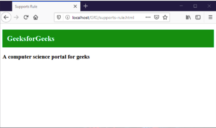
Example:
In this example, the browser is supported by the display property as a grid.
<!DOCTYPE html>
<html>
<head>
    <title>Supports Rule</title>
    <style>
        @supports (display: grid) {
            section h1 {
                background-color: green;
                color: white;
                padding: 15px;
            }
        }
    </style>
</head>
<body>
    <section>
        <h1>GeeksforGeeks</h1>
        <h3>A computer science portal for geeks</h3>
    </section>
</body>
</html>
Output:
2. @media : The @media conditional rules is a rule which is used to apply the style based on the media queries. It can be used to check the device width and/or height and apply the style specified based on that.
Syntax:
@media screen and ("condition") {
   /*  Style to apply  */
}
Example:
<!DOCTYPE html>
<html>
<head>
    <title>Media Rule</title>
    <style>
        @media screen and (max-width: 700px) {
            section {
                background-color: green;
                color: white;
                padding: 15px;
            }
        }
    </style>
</head>
<body>
    <section>
        <h1>GeeksforGeeks</h1>
        <h3>A computer science portal for geeks</h3>
    </section>
</body>
</html>
Output:
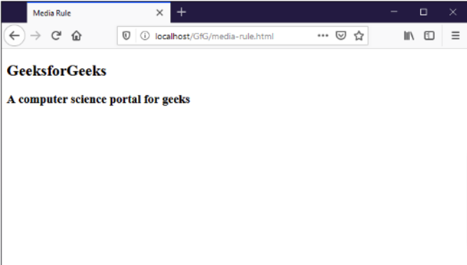
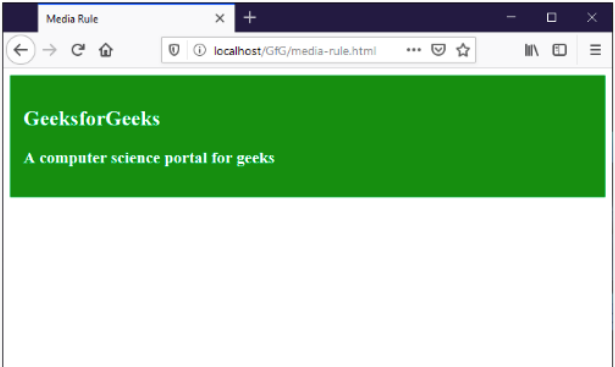
In the above example, when the width of the browser more then 700px, the style is not applied but when the browser window is made smaller than 700px, then the style gets applied.
Screen Width more than 700px
Screen Width less then or equal to 700px
3. @document: The @document conditional rule is used to apply style for specified URL i.e. the styling will only be applied on the specified URL.
Syntax
@document url(“YOUR-URL”) {
   /*  Style to apply  */
}
Note: It is experimental and works only on Firefox with -moz- prefix i.e. @-moz-document
Example:
<!DOCTYPE html>
<html>
<head>
    <title>Document Rule</title>
    <style>
        @-moz-document url("http://localhost/GfG/document-rule.html") {
            section h1 {
                background-color: green;
                color: #fff;
                padding: 15px;
            }
        }
    </style>
</head>
<body>
    <section>
        <h1>GeeksforGeeks</h1>
        <h3>A computer science portal for geeks</h3>
    </section>
</body>
</html>
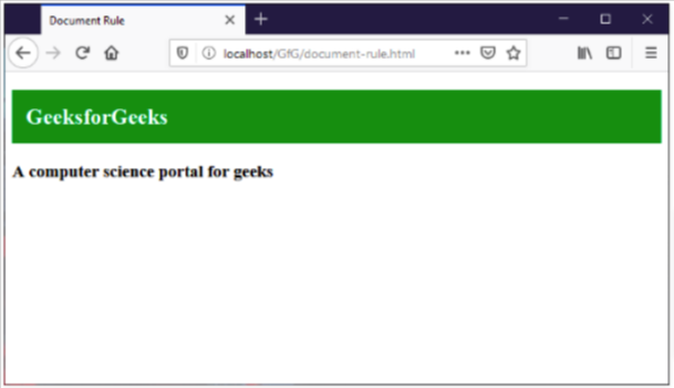
Output:
In this example, the style gets applied when the URL specified is the one being visited.