What Is Bulma Framework?
The Bulma framework is a free CSS solution based on the Flexbox layout. With Bulma, the extensive range of built-in features means faster turnaround and less CSS code writing.
Bulma is also fully open-source, which means that Bulma’s original source code is freely available for download — there’s no limit to how far you (and the growing Bulma community) can extend its functionality.
Why Use Bulma?
The main advantage of using Bulma is that its box model is fully based on
Flexbox . no more CSS floats and percentages.
- Responsiveness – 100% Responsive.Design for a mobile-first
- Every element in Bulma is mobile-first and optimizes for vertical reading, so by default on mobile:
- columns are stacked vertically
- the level component will show its children stacked vertically
- the nav menu will be hidden
- You can, however, enforce the horizontal layout for both columns or level by appending the is-mobile modifier.
Quick install
Bulma is constantly in development! Try it out now:
NPM
npm install bulmaImport
After installation, you can import the CSS file into your project using this snippet:
import ‘bulma/css/bulma.css’CDN
https://cdnjs.com/libraries/bulmaCSS only
Bulma is a CSS framework. As such, the sole output is a single CSS file:
bulma.cssYou can either use that file, “out of the box”, or download the Sass source files to customize the variables.
There is no JavaScript included. People generally want to use their own JS implementation (and usually already have one)
Browser Support
Bulma uses to make (most) Flexbox features compatible with earlier browser versions. Bulma is compatible with recent versions of :
- Chrome
- Edge
- Firefox
- Opera
- Safari
Internet Explorer (10+) is only partially supported.
For Bulma to work correctly, you need to make your webpage responsive.
1) Use the HTML5 doctype
<!DOCTYPE html>2) Add the responsive viewport meta tag
<meta name=”viewport” content=”width=device-width, initial-scale=1?>If you want to get started right away, you can use this HTML starter template. Just copy/paste this code in a file and save it on your computer.
<!DOCTYPE html>
<html>
<head>
<meta charset="utf-8">
<meta name="viewport" content="width=device-width, initial-scale=1">
<title>Hello Bulma!</title>
<link rel="stylesheet" href="https://cdnjs.cloudflare.com/ajax/libs/bulma/0.7.5/css/bulma.min.css">
<script defer src="https://use.fontawesome.com/releases/v5.3.1/js/all.js"></script>
</head>
<body>
  <section class="section">
    <div class="container">
       <h1 class="title">
    	  Hello World
       </h1>
       <p class="subtitle">
    	  My first website with <strong>Bulma</strong>!
       </p>
    </div>
  </section>
</body>
</html>
Bulma Advantage:
1) Lightweight
The CSS file of this framework is very lightweight as well as simple to customize.
2) Easy to Use
3) Responsive Design
4) Based on Flexbox
It allows our Front-end development experts to build fancy designs with integrated Flexbox.
5) Highly customizable and modularizable
6) Simple syntax :
The syntax uses a lot of is-center, is-child, button is-primary. It just reads well and makes sense.
Bulma Disadvantage:
1) The CSS of this framework runs very slow on IE web browser.
2) It is still in the development phase and the final version is yet to come.
3) Fairly new, not as large of a community.
How does Bulma work?
Bulma uses several techniques to make a cohesive interface for front-end developers. We need- just worry about describing our website’s design using semantic classes — not elements — or in other words, idiomatic templates.
These semantic templates are often thought of as interconnecting building-blocks we use to create websites fast! These components also are responsive out-of-the-box, meaning we will focus more on our content than the code.
The chances of Bulma CSS
The Flexbox layout may be a popular solution for developers, because it allows individuals to enhance item alignment, order, and directions in containers even when they’re during a dynamic setup. Since tons of web applications got to be primed to figure on any system today, it’s an honest idea to use a CSS that’s supported a system like Flexbox if you would like your apps to be responsive.
Aside from its Flexbox-based nature, which ensures that grid items and vertically-aligned components look incredible on your system, Bulma features a lot of other great benefits to supply too, including:
Responsivity: The framework is mobile-first and works similarly to the favored Bootstrap CSS.
Well-documented: Often a really important component for developers, Bulma is extremely well documented, and comes with a lively community of individuals able to help with projects.
Solid foundation: Bulma comes full of all of the products you’d expect from a CSS framework, including diverse typography, buttons, forms, tables, and more.
Various components: Bulma is full of a vertical alignment solution, layouts, and various media objects.
Modular: The Bulma setup is made with Sass, which suggests that you simply can design your framework step by step with only the features you would like .
For many developers, building sites and applications with Bulma is straightforward . Because there are numerous features to access straight out of the box, there’s not the maximum amount of code writing to try to do . Let’s check out a number of the foremost compelling features of Bulma in closer detail.
Modifiers
Want to make a totally unique app or website? With Bulma, you can. Many
of the weather , like buttons and tables, accompany alternative styles to settle on from. All you would like to try to do to use modifiers to your preferred elements is append one among the straightforward modifier classes that start with has- or is-. this suggests that you simply can change-text size, style, colour, and tons more.
Modifiers: Helpers
Float left and right
<div class="notification is-primary">

<button class="button is-warning is-pulled-right">Float right</button>

<button class="button is-danger is-pulled-left">Float left</button>

<p>Lorem ipsum dolor sit amet, consectetur adipiscing elit. Pellentesque risus mi, tempus quis placerat ut, porta nec nulla. Vestibulum rhoncus ac ex sit amet fringilla. Nullam gravida purus diam, et dictum felis venenatis efficitur. Aenean ac eleifend lacus, in mollis lectus. Donec sodales, arcu et sollicitudin porttitor, tortor urna tempor ligula, id porttitor mi magna a neque. Donec dui urna, vehicula et sem eget, facilisis sodales sem.</p>

</div>
Remove margin
<div class="box is-marginless">
	<h1 class="title">Title</h1>
	<p>Lorem ipsum dolor sit amet, consectetur adipiscing elit. Pellentesque risus mi, tempus quis placerat ut, porta nec nulla. Vestibulum rhoncus ac ex sit amet fringilla. </p>
</div>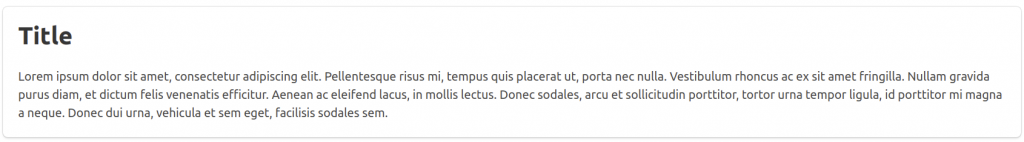
Remove padding
<div class="box is-paddingless">
	<h1 class="title">Title</h1>
	<p>Lorem ipsum dolor sit amet, consectetur adipiscing elit. Pellentesque risus mi, tempus quis placerat ut, porta nec nulla. Vestibulum rhoncus ac ex sit amet fringilla. Nullam gravida purus diam, et dictum felis venenatis efficitur. </p>
</div>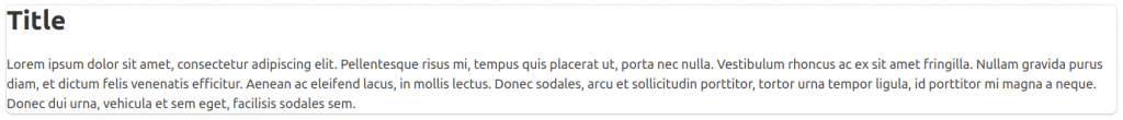
Layout
Probably one among the simplest sections of the Bulma CSS, the layout section is brimming with customisation options to settle on from. While other frameworks offer you the fundamentals like forms, styling, and buttons, Bulma features a range of unique layout components. There’s a “Hero” section where you’ll showcase major titles and pictures on your design, also as a “level” feature which suggests that you simply can vertically centre different elements of your application or design.
Columns
The responsive columns in Bulma are easy to make and optimise consistent with your personal preferences. you’ll add as many columns as you would like to a page in several colours, and each column is going to be an equal width, resulting in a more clean and clear page set-up. you’ll control sizes, grid layout, and more supported nesting and viewport, also as sizing the gap between columns. Because Bulma is predicated on Flexbox, if you don’t want to play with anything, you’ll still rest assured that everything will look even on your app.
Layout: Columns
Two columns grid
<div class="columns">
<div class="column">
	<div class="box">.column</div>
</div>
<div class="column">
<div class="box">.column</div>
</div>
</div>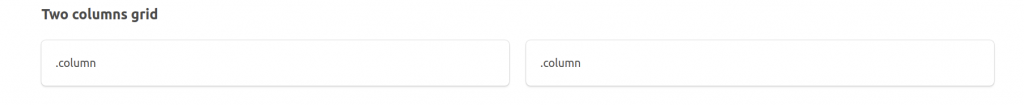
Three columns grid
<div class="columns">
	<div class="column">
		<div class="box">.column</div>
	</div>
	<div class="column">
		<div class="box">.column</div>
	</div>
	<div class="column">
		<div class="box">.column</div>
	</div>
</div>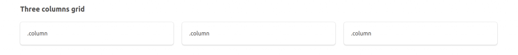
Forms
Forms are often a crucial part of an internet site or application, and Bulma allows you to make yours with ease. With many form control classes supported, the answer is meant for consistency. The “control” container allows you to reinforce various single form controls, so you’ll have the right input for every page.
Forms: General
Form controls: Wrap form controls in a .control container
<section class="section">
<div class="container">
<div class="control">
<input type="text" class="input" id="textInput" placeholder="Text input">
</div>
<div class="control">
	<div class="select">
		<select>
		<option vaiue="">Default select</option>
		<option value="1">Option 1</option>
		<option value="2">Option 2</option>
		<option value="3">Option 3</option>
		</select>
	</div>
</div>
</div>
</section>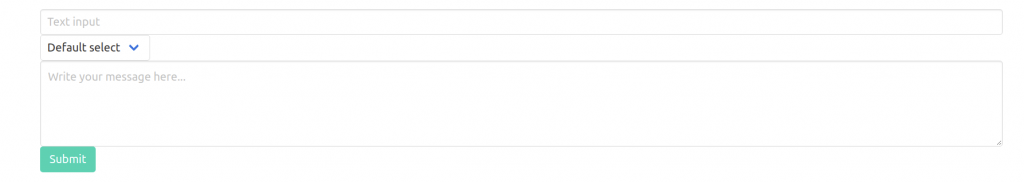
Form fields: Wrap label/input/help text/button in a .field container
form>
	<div class="field">
		<label class="label" for="textInput">Text input</label>
			<div class="control">
			<input type="text" class="input" id="textInput" placeholder="Text input">
			</div>
			<p class="help">Descriptive help text for the input element.</p>
	</div>
	<div class="field">
		<label class="label" for="numberInput">Number input</label>
		<div class="control">
		<input type="number" class="input" id="numberInput" placeholder="1234">
		</div>
		<p class="help">Descriptive help text for the input element.</p>
	</div>
	<div class="field">
		<div class="control">
			<button type="submit" class="button is-primary">Submit</button>
		</div>
	</div>
</form>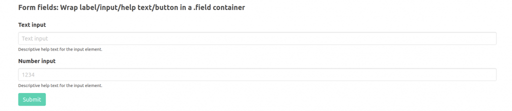
Reference Link :- https://mobiosolutions.com/what-is-bulma-advantages-disadvantages-of-using-bulma-2/